
In software development, good practices prescribe monitoring the progress of testing teams by project and resources. The Jira dashboard fills this need as it tracks defects, issues, project health and team member workloads.
The Jira dashboard also allows managers to report on project status, defect counts, and resource allocation. At OnPath, we gather data as part of our testing services report for clients and use JIRA for the convenience of an easy to create, easy to visualize dashboard.
This tool delivers easy-to-view and analyze statistics for different fields. Dashboard data can be filtered and visually represented in a variety of ways by using the gadgets that work best for client needs. Jira dashboards also display real-time data, so clients have up to date information. The dashboard can also be configured for auto-refresh time period for a gadget or specify a refresh order. JIRA dashboards can accommodate multiple projects, so you can monitor all projects and teams in a single location.
The following Jira dashboard gadgets help QA leads or managers prepare real-time project reporting.
- Average Age Report: This report is a bar chart showing the average duration (in days) for which issues remained unresolved by time period. The project and the issue query is determined by the user, as is the unit of time. Units of time include hours, days, months or years.
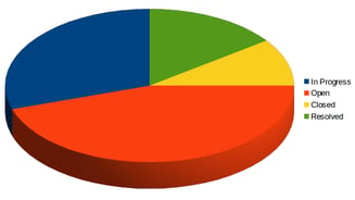
Filtering out the tickets marked for a later stage keeps the metric focused on the current effort. When reading these numbers, expect to find a higher average age when the project is in development and the team is ironing out process and communication issues. Looking at the average age report gives the QA management team an idea of the health of the project, and identifies concerns. Click here for a sample Average Age Report. - Pie Chart Report: This report displays the issues of a project filtered by a query in the form of a pie chart. A pie chart displays the status of the issues related to a project, allowing users to quickly see open issues, issues in progress, and issues closed and resolved. Pie charts are useful as a high-level overview of the current build quality.
- Recently Created Issues Report
The Recently Created Issues Report is useful for tracking new issues reported during the SDLC. Users can analyze the data and determine if the application release quality is improving or degrading. The report can be used to identify trouble spots within a code base based on the number of new issues reported.
- Resolution Time Report
The Resolution Time Report shows how long it is taking to fix reported issues. It is handy for identifying sprint release blockers early so they don’t impact the release date. It can also be used as a type of team velocity report for fixing reported issues.
Jira offers a large variety of reports for any QA team needs, and tracks of projects in all phases, alerting project managers as to when release dates are at risk. Quality testing is an investment. Measure your ROI effectively by leveraging Jira dashboards and reporting. Jira reports are completely configurable so you can make them match your project or even specific client or customer needs. At OnPath we help our clients discover the full potential of their software by providing testing expertise that returns positive results.